Chiderah Anokam

Data / Business Analyst

SAS, SQL, Power BI, Data Analytics

I turn raw business data into validated analytical datasets, interactive dashboards, and actionable business insights.

Portrait of Chiderah Anokam

Core skills

  • SAS
  • SQL
  • Power BI
  • DAX
  • Excel
  • Data Quality
  • Data Visualization
  • Business Analysis

Also: MS Access, Microsoft Office Suite (Excel, Word, PowerPoint, Outlook), SQL Server, DB2, Oracle Database, IDR, Adobe Creative Suite, Linux (command line)

Featured case study: NorthStar Medical Group

A portfolio project that follows one business question from raw claims data to a filterable Power BI dashboard: how is the practice performing on claims volume, revenue, collections, denials and payment speed?

This is a portfolio project built on synthetic data. It is not a client engagement, and no real patients, providers or protected health information are represented.

Read the case study

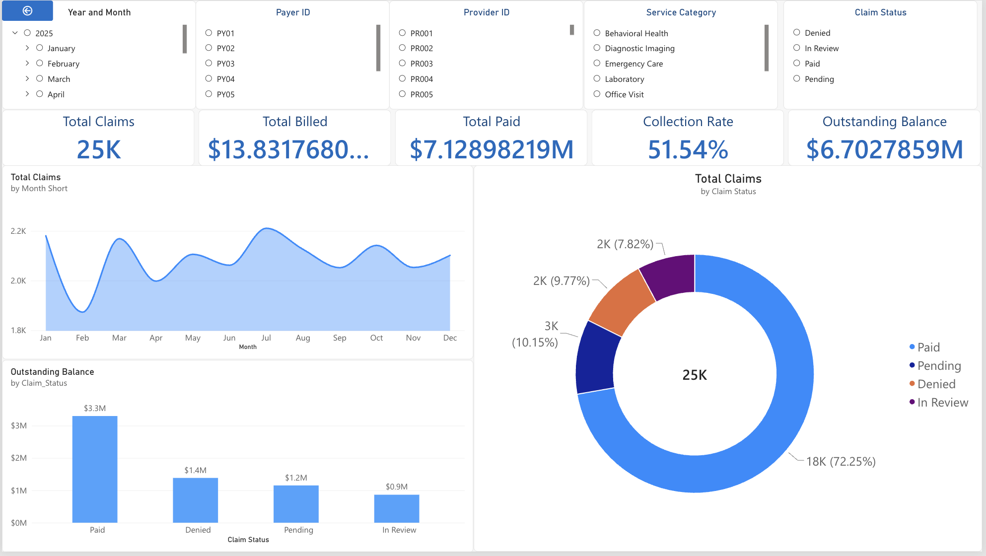
Static screenshot of the NorthStar revenue cycle dashboard showing KPI cards, claims by month, claim status donut and outstanding balance by status Static screenshot

NorthStar Medical Group: Healthcare Revenue Cycle Analytics

Business problem, analytical process, technical implementation, insight.

Business problem

NorthStar's leadership needs one place to see how money moves from a claim being billed to a claim being collected, and where it gets stuck. In plain terms: how many claims are we sending, how much do we bill, how much do we actually collect, how much is still owed, how often do payers say no, and how long do they take to pay?

Leadership needs visibility into:

  • Claims volume
  • Billed revenue
  • Collections
  • Outstanding balances
  • Denials
  • Payment turnaround

What users need to do with it

Managers should be able to slice the same numbers by:

  • Date (year and month)
  • Payer
  • Provider
  • Service category
  • Claim status

Source: project requirements document. Data covers .

My approach

Select a stage to see what happened there.

Raw Excel data

An Excel workbook with five sheets: claims ( rows, 14 columns), patients, providers, payers and a calendar. The claims sheet arrives with realistic problems: repeated claim IDs, blank payment days, inconsistent text casing and spacing.

Output: Northstar_Data_Raw.xlsx

Methodology

This project is built to show analytical thinking, not only tool use. Each stage has a distinct job and a distinct output.

Raw data
Untouched source workbook. Never edited.
Preparation
SAS import, inspection, de-duplication, validation.
Transformation
Derived fields and status flags in the analytical table.
Analysis
SQL aggregates that produce the reference answers.
Visualization
Power BI model, measures and report.
Insights
Findings and what to do about them.

SAS: data preparation and validation

Selected excerpts from NorthStar.sas. Each block explains the analytical decision, not only the syntax.

1. Import and de-duplicate

What it does
Reads the Excel claims sheet into SAS and builds claims_sorted, sorted by Claim_ID with repeated IDs removed.
Why
PROC SORT ... NODUPKEY keeps the first record for each key and is the standard way to enforce one row per claim.
Business purpose
A claim counted twice inflates billed revenue and claim volume.

2. Inspect before trusting

What it does
Lists variable types, previews rows, and tabulates every categorical field including blanks, then summarises the numeric fields.
Why
The / missing option shows blank categories instead of hiding them. PROC MEANS reveals ranges that point to bad values.
Business purpose
Finds problems early, so cleaning rules come from evidence.

3. Prove the duplicates are real

What it does
Compares total rows with distinct Claim IDs, then lists which IDs repeat and how often.
Why
Removing rows should be a verified decision with a count attached.
Business purpose
Quantifies the size of the problem. Here, rows hold unique claims.

4. Validate: missing values, status logic, financial logic

What it does
Counts blanks per field, checks whether blank payment days and denial reasons are explained by claim status, and tests that billed ≥ allowed ≥ paid.
Why
A blank is only acceptable if the business rules explain it. These checks separate expected blanks from errors.
Business purpose
Confidence that the money fields obey real-world logic. See the data quality results.

5. Catch and fix the date problem

What it does
Checks the minimum and maximum service date. The values were Excel serial numbers, so the dates came out wrong.
Why
Excel counts days from 1900 and SAS from 1960. Subtracting 21,916 converts one to the other.
Business purpose
Month and year drive the trend chart and the date slicer, so wrong dates would silently break time analysis.

6. Build the analytical dataset

What it does
Creates the final table with a corrected date, Outstanding_Balance, year, month, and 0/1 status flags.
Why
Doing the derivations once, upstream, keeps Power BI measures short and consistent.
Business purpose
One governed table feeds every number on the dashboard.

SQL: aggregation and reconciliation

SQL (SAS PROC SQL) turns claim rows into the summary answers leadership asks for, and serves as an independent check on the dashboard.

  • Aggregation
  • Grouping
  • Filtering with CASE
  • Financial analysis
  • Status analysis
  • Denial analysis
  • Validation

Claim status mix

Purpose
Shows what share of claims is paid, pending, denied or in review. A subquery supplies the total so each percentage is calculated in one pass.

Headline financials

Purpose
Billed, allowed, paid, outstanding and collection rate in one result. Collection rate is paid ÷ billed. calculated reuses an alias instead of repeating the sum.

Outstanding balance by status

Purpose
Answers where unpaid money sits, and what share of the total each status holds. This prioritises follow-up work.

Denial rate

Purpose
Conditional counting with CASE gives denied claims and denial rate without a separate filter step.

Reconcile the analytical table

Purpose
Row count, unique claims and every total on the final table, ready to compare with what Power BI shows.

Payer, provider and payment-turnaround views are handled in the Power BI report through slicers. Payment turnaround is summarised in SAS with PROC MEANS.

Power BI: model, measures and dashboard

From the analytical table to an interactive report.

Data model

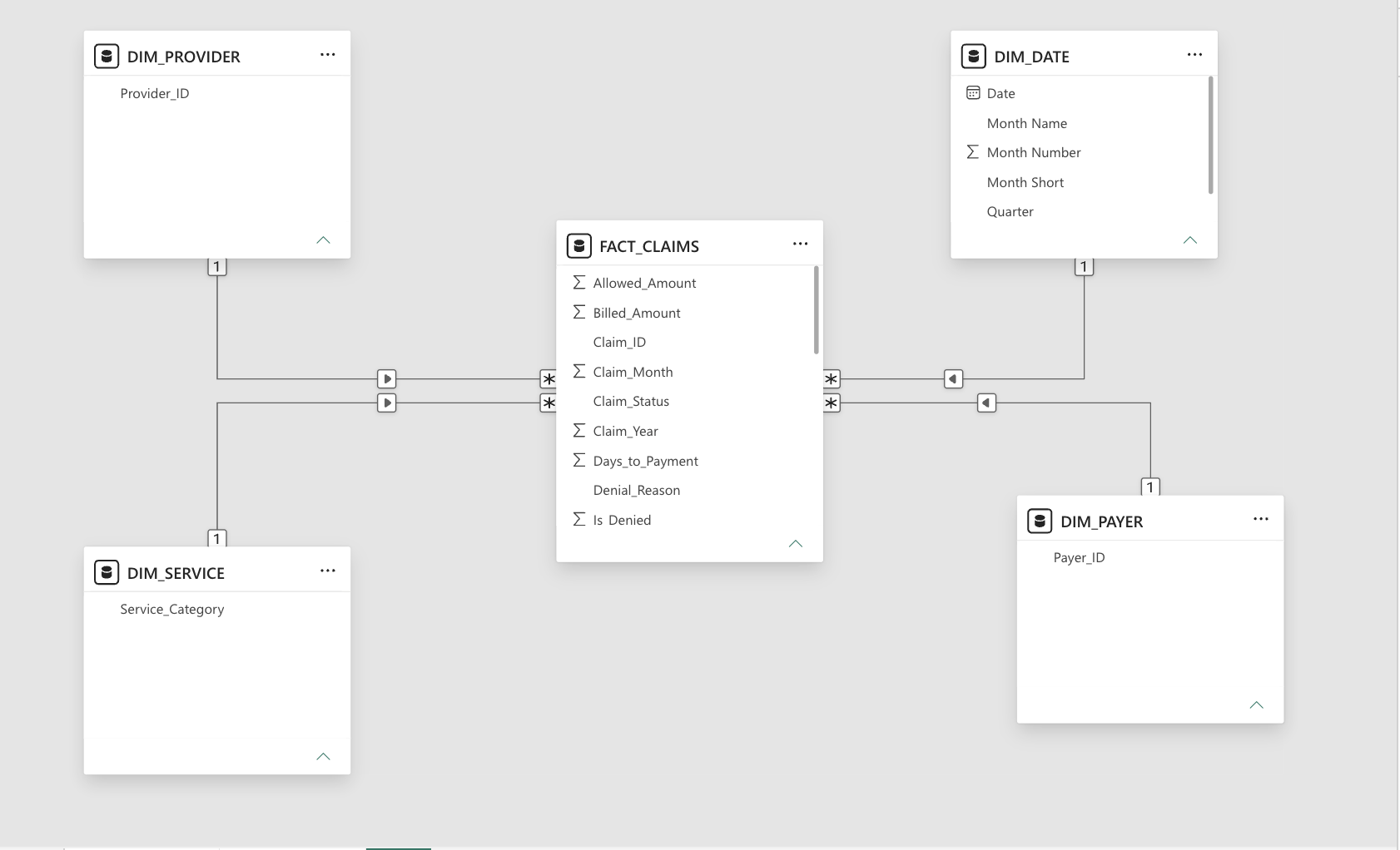
The report uses a star schema. FACT_CLAIMS holds the claim-level numbers (billed, allowed, paid, days to payment, status, denial reason, year, month, Is_Denied). Four dimension tables each connect to it with a many-to-one relationship:

  • DIM_PAYER on Payer_ID
  • DIM_PROVIDER on Provider_ID
  • DIM_SERVICE on Service_Category
  • DIM_DATE on Date (month name, month number, month short, quarter)

Because filters flow from dimensions to the fact table, one slicer click changes every visual consistently.

Power BI model view: FACT_CLAIMS in the centre connected to DIM_PROVIDER, DIM_SERVICE, DIM_DATE and DIM_PAYER
Model view from Power BI Service.

Dashboard

Static screenshot, not interactive Open interactive Power BI report
Screenshot of the NorthStar dashboard with slicers for year and month, payer, provider, service category and claim status; KPI cards; claims by month; claims by status; outstanding balance by status

KPI design

Five cards in one row: total claims, total billed, total paid, collection rate and outstanding balance. They follow the order of the revenue cycle, from volume to money billed to money collected to money still owed.

Slicers

Year and month, payer ID, provider ID, service category and claim status. They sit across the top so filters are visible before the numbers.

Visual choices

An area chart for claims by month (trend over time), a donut for claim status (parts of a whole with four categories), and a column chart for outstanding balance by status (comparing amounts).

DAX measures

Nine measures sit on top of the fact table. Totals are simple sums; ratios use DIVIDE, which returns blank instead of an error when the denominator is zero. Rates are formatted as percentages in Power BI rather than multiplied by 100 in the formula.

Outstanding Balance
Sums the claim-level field built in SAS, so Power BI reconciles to the SAS and SQL result.
Denied Claims
CALCULATE changes the filter context to Denied claims only, so the same measure responds to every slicer.
Average Days to Payment
Restricted to Paid claims on purpose. Claims that are denied, pending or in review have no payment date, so a plain average would mix in claims that were never paid.

Business insights

Every figure below is taken from the Power BI dashboard or calculated directly from the source workbook.

Total claims
Total billed
Total allowed
Total paid
Outstanding balance
Collection rate
Denial rate
Avg. days to payment

Claim status distribution

Outstanding balance by claim status

What the analysis found

  1. About half of billed revenue has been collected.
  2. Most outstanding money is on claims already marked Paid. That is billed amount not recovered, for example contractual adjustments or patient responsibility. It deserves its own review, because it is not the same as unpaid claims.
  3. Denials are a small share of claims but a large source of lost cash.
  4. Payments arrive in about a month.
  5. Authorization is the most common denial reason.

Item 2 interprets the numbers. The dataset does not say why paid claims carry a balance, so treat that explanation as a hypothesis to check.

Data quality

Results of the SAS validation checks on the raw claims sheet ( rows). Each check protects a number on the dashboard.

Duplicate records

extra rows share a Claim ID with another row ( unique IDs). are exact copies.

Prevents double-counting claims and revenue.

Missing payment turnaround

blank values. belong to denied, pending or in-review claims, where no payment exists yet. are on Paid claims and need source follow-up.

Keeps average days-to-payment from being calculated on claims that were never paid.

Invalid financial relationships

0

claims with billed below allowed, allowed below paid, or paid above billed.

Confirms revenue fields follow billing logic before totals are trusted.

Status validation

rows have inconsistent spacing or casing in Claim_Status_Raw (for example " PAID"). The standardised Claim_Status column matches it on every row, and all four statuses are valid.

Stops one status from splitting into several categories in charts and slicers.

Denial reason validation

/

denied claims carry a reason. No non-denied claim has one. reasons differ only by letter case.

Makes denial-reason analysis reliable. The remaining denied claims without a reason are a data-capture gap.

Missing key fields

0

missing Claim ID, Patient ID, Payer ID, Provider ID, service date, service category, amounts or status. Missing counts were checked on all 12 fields.

Ensures every claim can be filtered by every slicer.

Denial-reason counts after standardising letter case:

Technical architecture

How the pieces connect, from source file to decision.

  1. Source
    Excel / raw data
  2. Prepare
    SAS
    SQL
    Analytical dataset
  3. Model
    Power BI model
    DAX measures
  4. Deliver
    Interactive dashboard
    Business insights

About me

I am an early-career Data / Business Analyst with a background in Information Systems. I enjoy the unglamorous part of analytics that makes results trustworthy: profiling data, finding what is wrong with it, and proving the final numbers add up.

My resume lists internship experience preparing and validating Medicare/Medicaid and health-insurance claims data with SAS, and certification as a SAS Certified Specialist in Base Programming for SAS 9.4. The NorthStar project is where I brought SAS, SQL and Power BI together in one workflow.

Education
University of Maryland, Baltimore County, Information Systems (2023–2025); University of Maryland Global Campus, Computer Science (2021–2025)
Certification
SAS Certified Specialist: Base Programming Using SAS 9.4 (July 2021). CompTIA Security+ in progress.
Experience
Internships at RELI Group and Oscar Health Insurance, as listed on the resume.
Based in
Maryland, U.S.

Resume

Your browser cannot preview PDFs here. Use the buttons above to open or download the resume.

Contact

Open to Data / Business Analyst opportunities.

  • Email
  • LinkedIn